Leaz’Com is a communication agency that aims to assist businesses and associations in the region in the management and development of their communication.
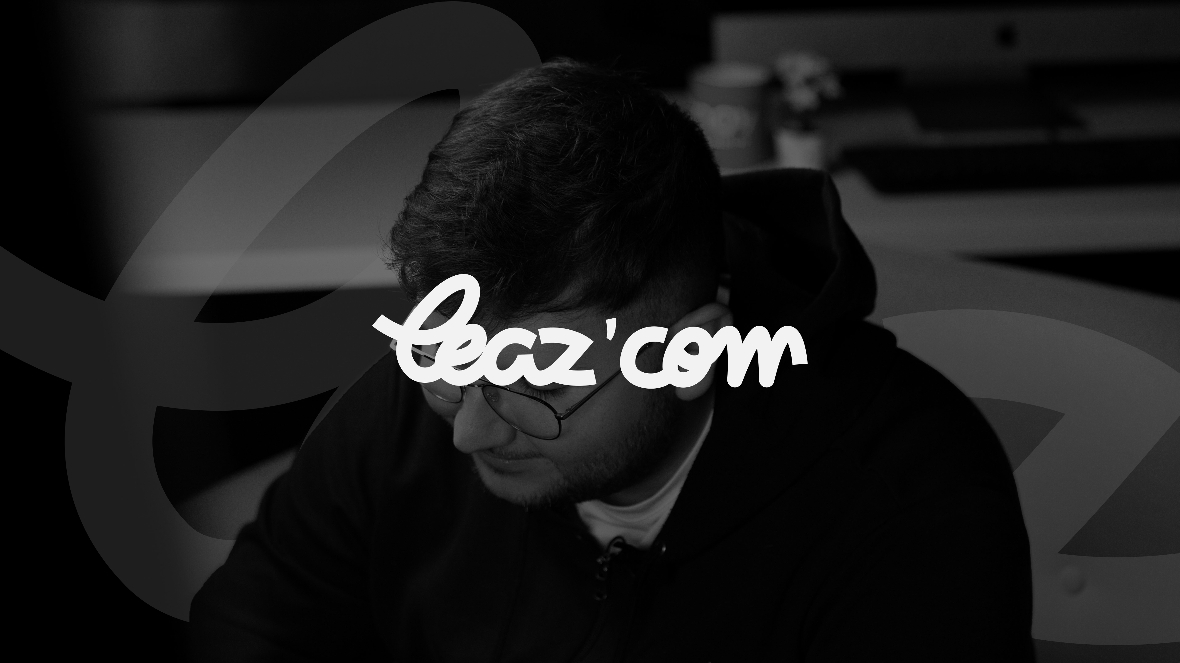
The logo
Creativity, transparency, proximity, and support are the core values of Leaz’com. It is in this spirit that the logo has been designed, featuring rounded shapes and a script typography for a simple and light reading experience, conveying a sense of comfort. Leaz’com relies on its own values to visually represent them.
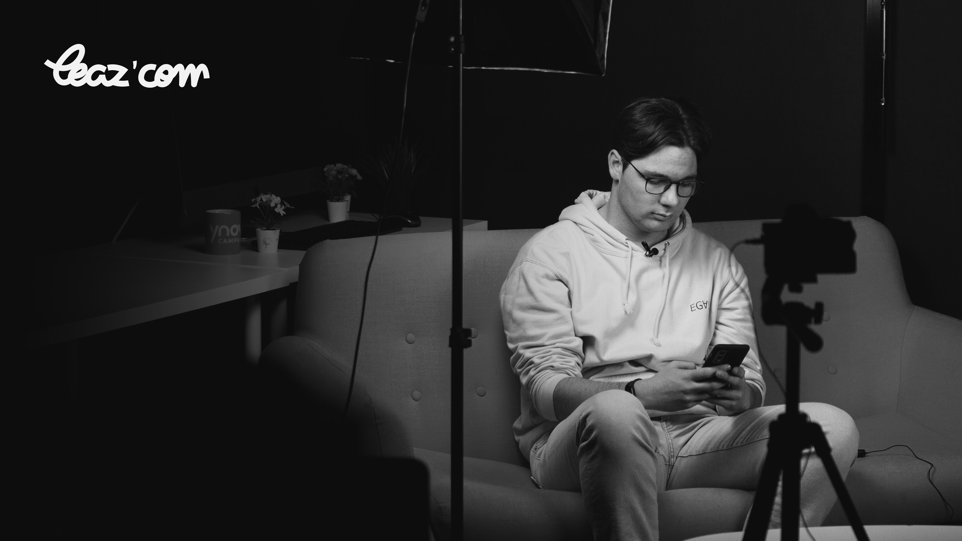
The variation
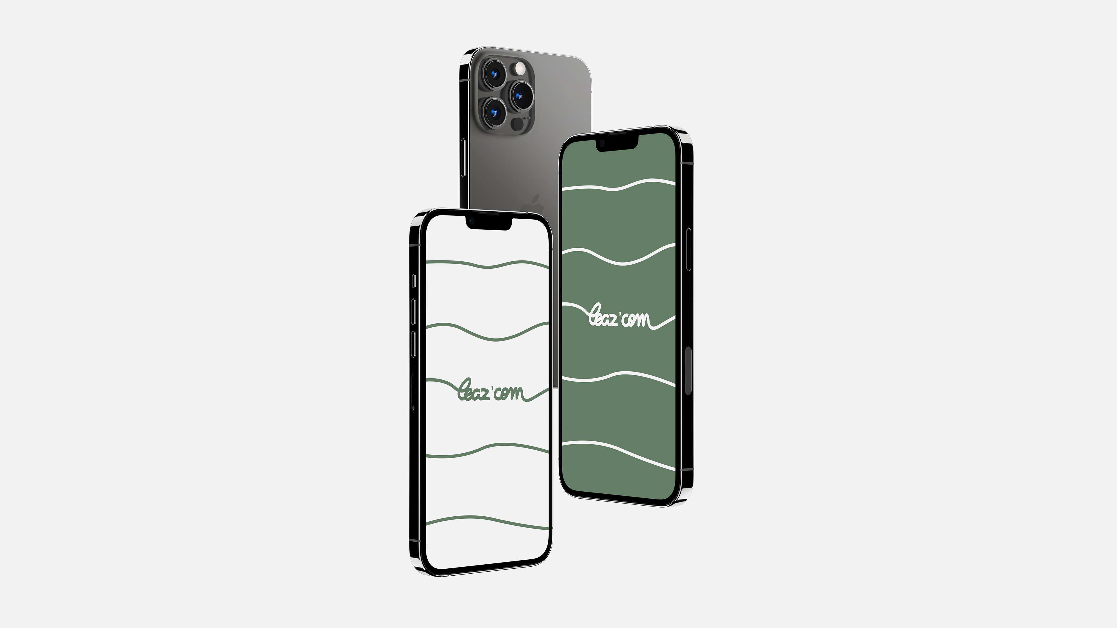
The logo’s variation will be applied based on readability. It can be featured in its primary color, but it is also integrated in reverse on a colored background to observe its performance in different settings. Additionally, we have a monogram that creates a pattern, a signature for our logo.
Colorimetry
The main color is chosen to convey a reassuring and professional feel, aiming to share a sense of gentleness while maintaining a serious and dynamic aspect that represents the company.
« B’Leaz » serves as the accompanying color for various visuals, providing a broader palette in case readability is compromised.
The main typography
The main typography complements the logo and various graphic elements. It ensures readability and graphic consistency across different visuals.
The secondary typography.
Secondary typography can be used on an occasional basis. It serves as a heading font, enabling the hierarchical organization of text alongside the primary typography.
Website
The website is coming very soon!
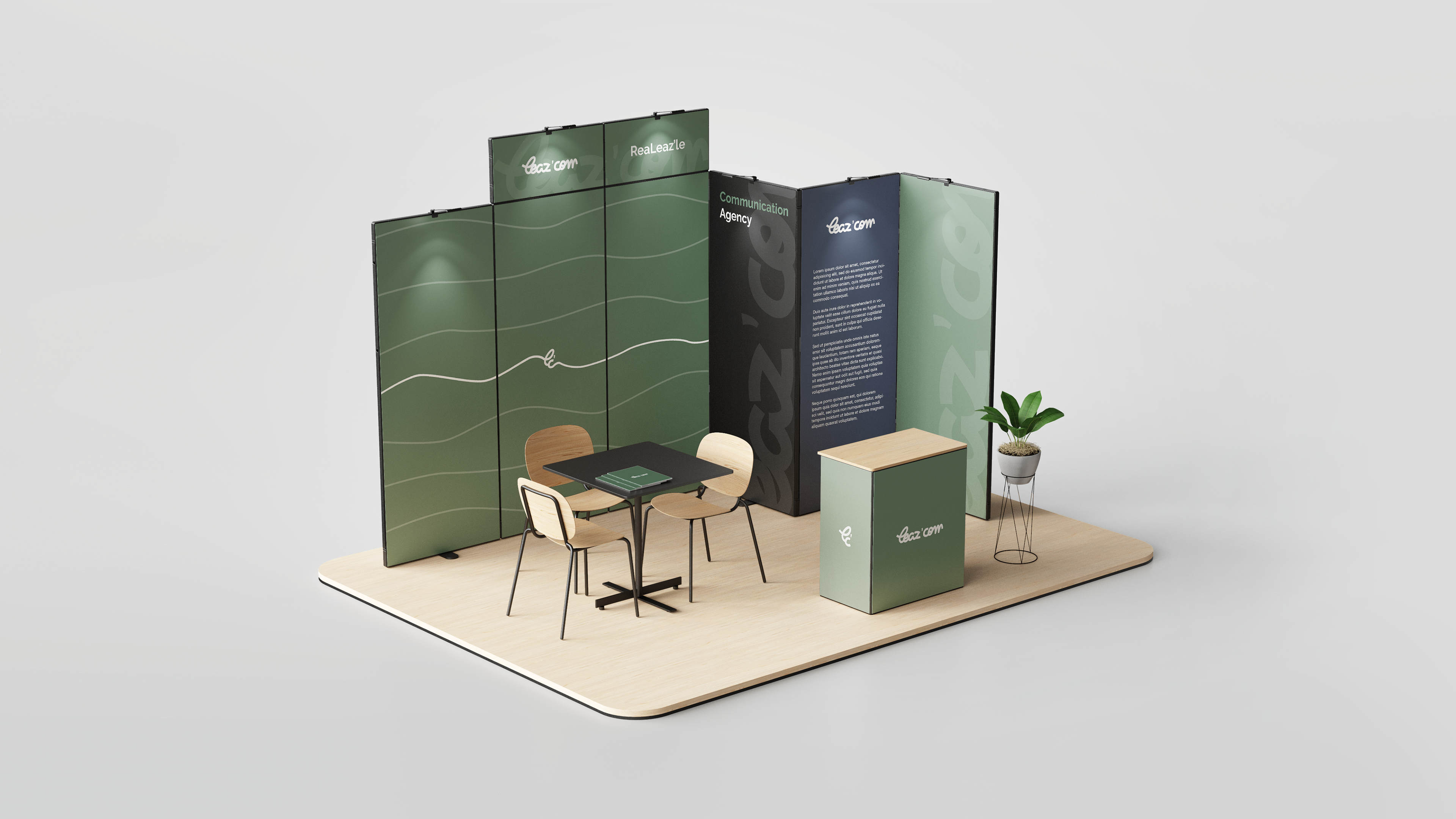
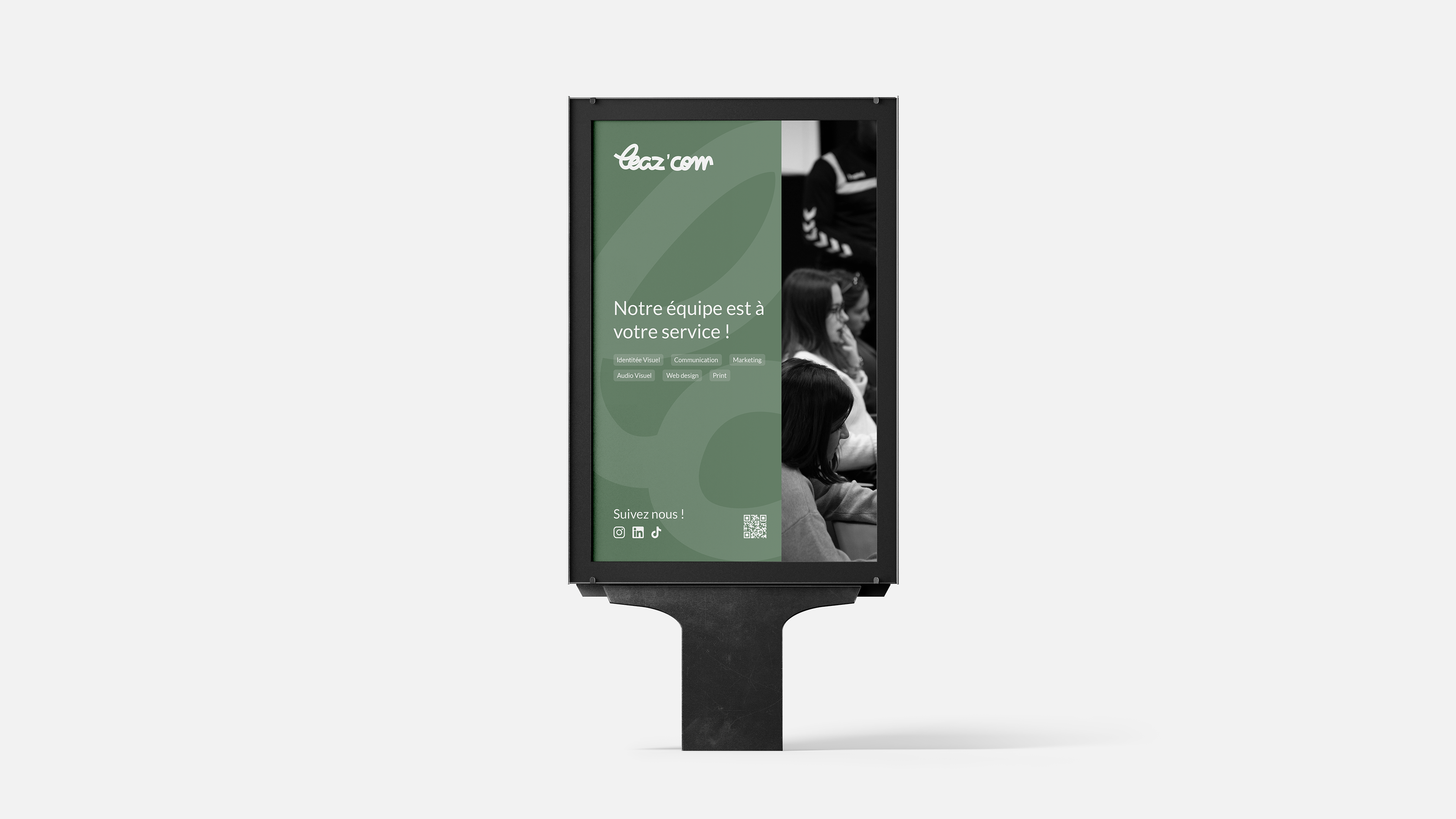
Print & Mockup
Below are several scenarios for the visual identity of Leaz’com.
Find us on our website, LinkedIn, Instagram, and TikTok!
Artistic Direction / Pierre ALIS & Matéo BIDAUD Graphic Design / Pierre ALIS, Cyprien VINCENT & Matéo BIDAUD Photography / Matéo BIDAUD Web Layout / Cyprien VINCENT Motion Design / Matéo BIDAUD